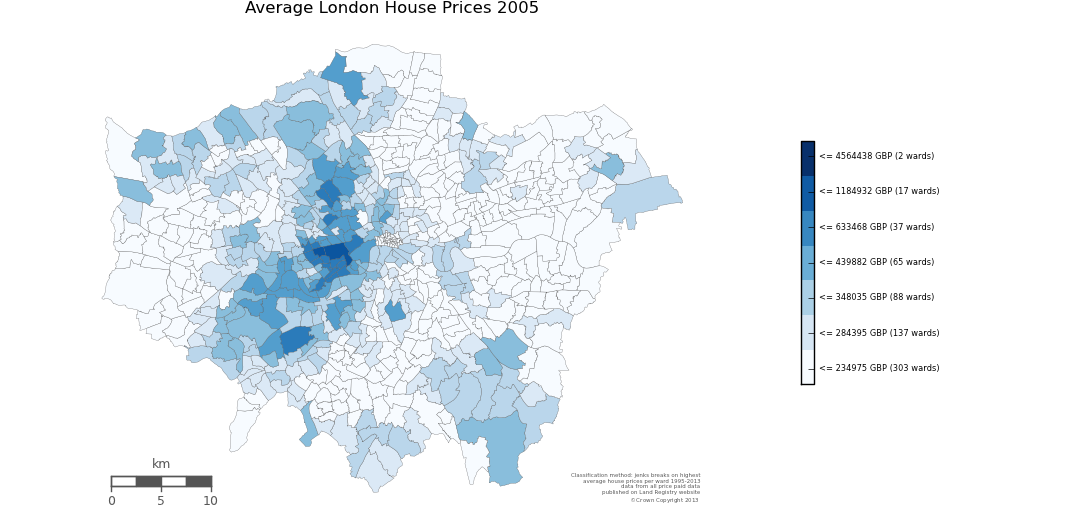
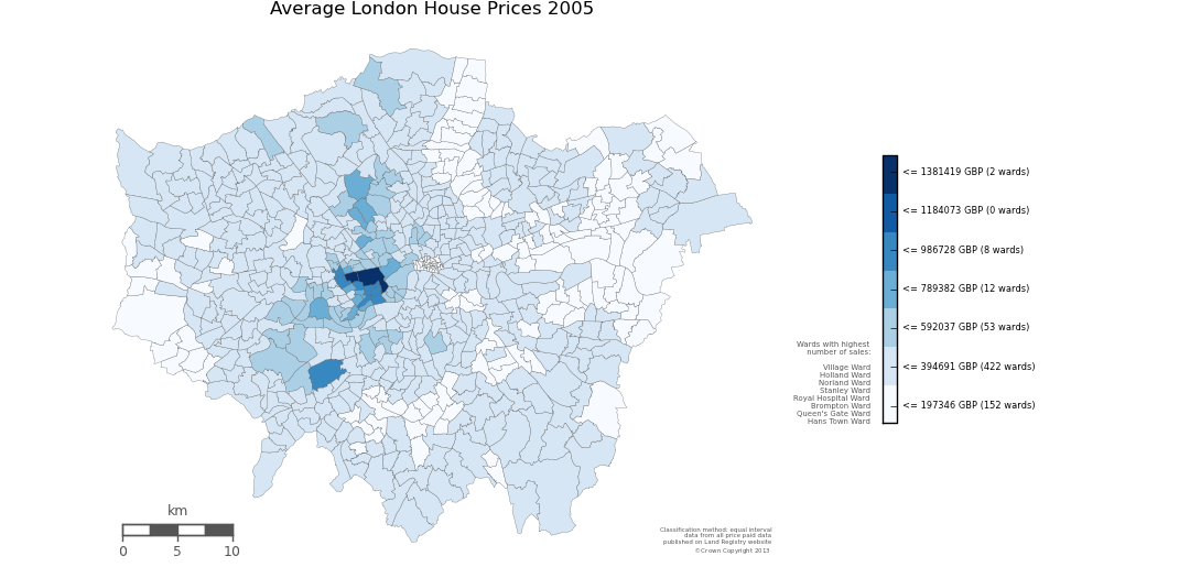
London is constantly ranked one of the most expensive cities to live in. Over the past two decades, house prices have risen continously. This data visualisation project explores the development of London's housing market. It aims to visualise the increase in London house prices over time and how the prices are distributed across space. This project is accompanied by a blog which can be found here.